Summary
In this part of the series, I’m going to highlight using “date-tools” and a basic pipeline-aggregating approach to aggregate and organise the data for initial analysis and plotting.
The lubdridate package makes extracting key time-interval units from dateTime objects simple. These indices (i.e. year, month, day of year etc.) will become the primary grouping variables for the data aggregation.
setwd("C:/Users/daniel/Desktop/locstore/portfolio")
source("static/data/customTheme.r")

library(lubridate)
library(tidyverse)
library(magrittr)
library(knitr)
library(purrr)
library(kableExtra)
library(extrafont)

Wind <- read_delim("static/data/winds/Wind.tsv", "\t",
                   escape_double = FALSE,
                   col_types = cols(datetime = col_character(),
                                    visibility_distance = col_double()),trim_ws = TRUE)

# extract date/time indices of interest
Wind$datetime <- ymd_hms(Wind$datetime)
Wind$yrDT <-year(Wind$datetime)
Wind$monthDT <-month(Wind$datetime)
Wind$dayDT <-day(Wind$datetime)
Wind$ydayDT <-yday(Wind$datetime)
Data Aggregation
Using a pipeline workflow (i.e. magrittr) I aggregated the data into two temporal-frames; by Year and by Month.
extreme_byYear <- Wind %>% group_by(yrDT,usaf_station) %>%
  arrange(usaf_station,yrDT,wind_speed) %>%
  filter(wind_speed > quantile(wind_speed, 0.95,na.rm=TRUE)) %>% ungroup()

extreme_byMonth <- Wind %>% group_by(monthDT,usaf_station) %>%
  arrange(usaf_station,wind_speed) %>%
  filter(wind_speed > quantile(wind_speed, 0.95,na.rm=TRUE))

kable(head(extreme_byMonth),"html") %>%kable_styling(font_size=12)| usaf_station | elevation | wind_direction | wind_speed | visibility_distance | datetime | location | lat | lon | yrDT | monthDT | dayDT | ydayDT |
|---|---|---|---|---|---|---|---|---|---|---|---|---|
| 688130 | 3 | 220 | 67 | 999999 | 2014-05-04 15:00:00 | ROBBEN ISLAND | -33.8 | 18.367 | 2014 | 5 | 4 | 124 |
| 688130 | 3 | 130 | 67 | 999999 | 2014-05-05 12:00:00 | ROBBEN ISLAND | -33.8 | 18.367 | 2014 | 5 | 5 | 125 |
| 688130 | 3 | 130 | 67 | 999999 | 2014-05-05 15:00:00 | ROBBEN ISLAND | -33.8 | 18.367 | 2014 | 5 | 5 | 125 |
| 688130 | 3 | 130 | 67 | 999999 | 2014-05-17 06:00:00 | ROBBEN ISLAND | -33.8 | 18.367 | 2014 | 5 | 17 | 137 |
| 688130 | 3 | 350 | 67 | 999999 | 2014-05-24 03:00:00 | ROBBEN ISLAND | -33.8 | 18.367 | 2014 | 5 | 24 | 144 |
| 688130 | 3 | 330 | 67 | 999999 | 2014-05-24 21:00:00 | ROBBEN ISLAND | -33.8 | 18.367 | 2014 | 5 | 24 | 144 |
Explorative Plots
- What role does seasonality play on the distribution of extreme winds (and most damaging!) throughout a calendar year?
# Plot of the seasonal patterns at each location
ggplot(extreme_byMonth,aes(factor(monthDT),fill=location)) +
  geom_bar() +
  facet_wrap(~location,ncol=2,scales="free",as.table=TRUE) +
  theme_plain(base_size=10) +
  xlab("Month of Year") +
  ylab("Occurence (n times)") +
  labs(title="95th Percentile Wind Speed Occurence Patterns across a Calendar Year (2005-2015)",
       fill="Location")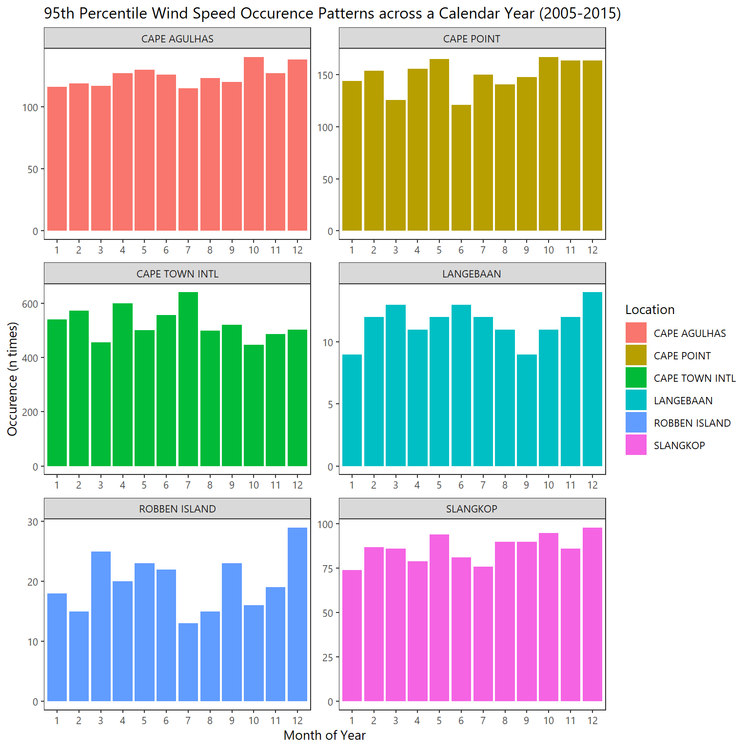
This above graphic clearly illustrates the spatial heterogeneity between stations.
- One can inspect the “bundling” of extreme wind periods in a year by using a daily interval. Combined with the byYear temporal-frame one can begin to uncover the distribution of the most severe winds for each station by year across the entire record.
# Plot of occurence "bundles" across all years by station
ggplot(extreme_byYear, aes(ydayDT,wind_speed,color=location)) +
  geom_point(size=0.5) + facet_wrap(~yrDT) +
  theme_plain(base_size=10) + theme(aspect.ratio=1,legend.position="bottom") +
  xlab("Day of Year") +
  ylab("Wind Speed (km/h)") +
  labs(title="Occurence Patterns of Most Extreme Winds",
       fill="Location") + guides(color=guide_legend(title="Location"))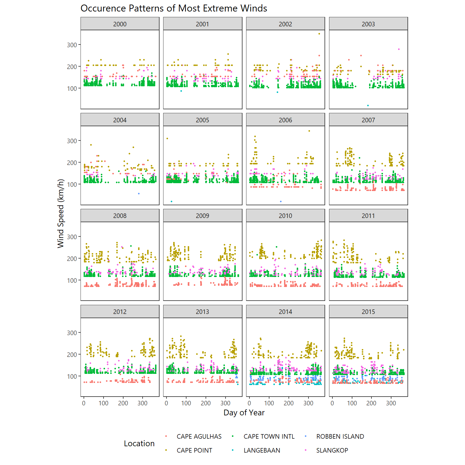
Leveraging purrr for power plotting
Below is a BONUS example of using purrr to deal with cramped facet_plot layouts. Nest the grouping variable and map this data frame of lists (of filtered data if necessary) using map2 with ggplot2.
In addition map2 is used to write the separate frames to file (passing the file names and data to ggsave)!
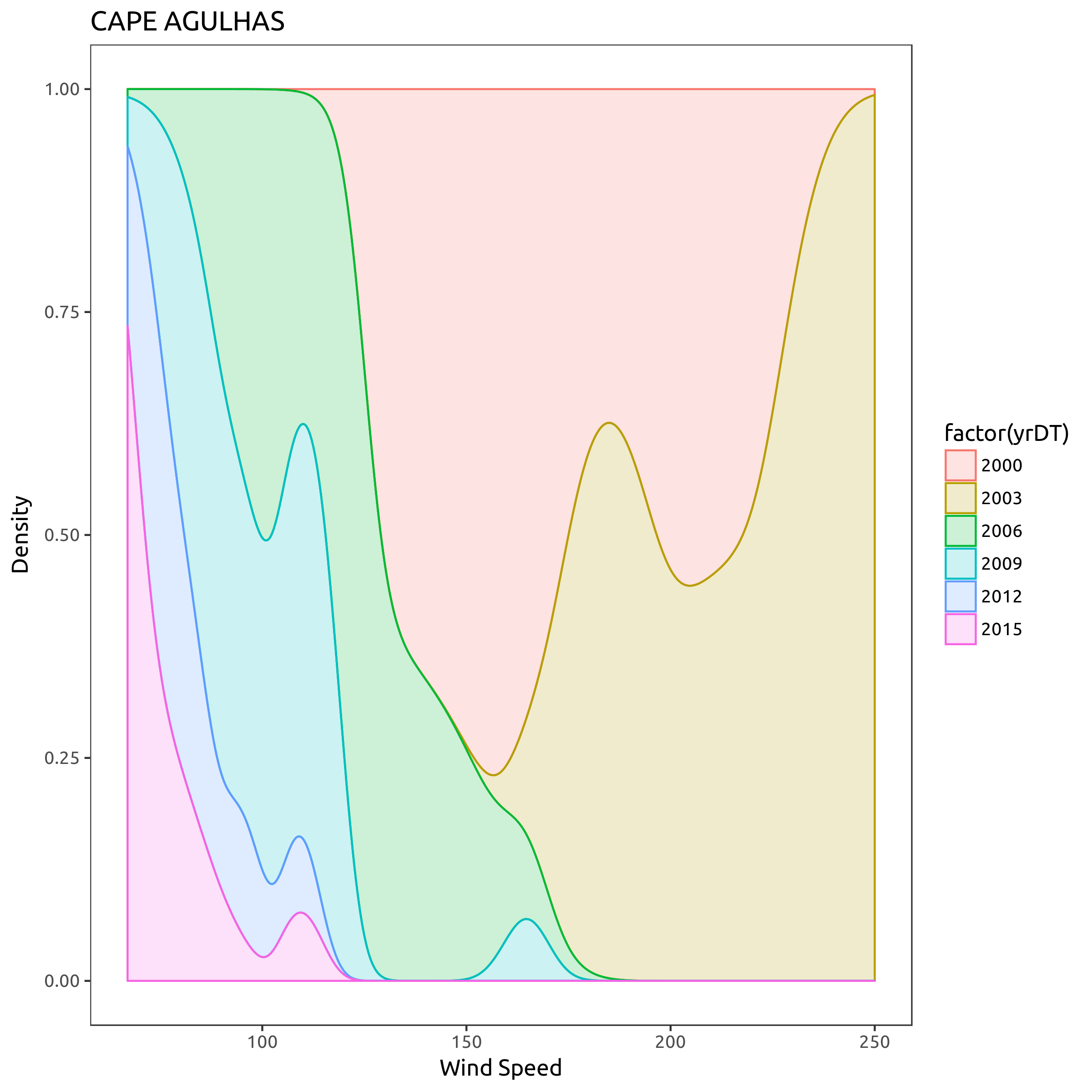
# define selection of choice
location_list <- c("CAPE AGULHAS","SLANGKOP", "CAPE TOWN INTL")
date_list <- c(2000,2003,2006,2009,2012,2015)

# apply filters
small_selection <- extreme_byYear %>%
  filter(location %in% location_list) %>% filter(yrDT %in% date_list)

# set data in correct order
small_selection <- small_selection %>%
  mutate(location = factor(location, levels = location_list,
                           ordered = TRUE))

# build plot using purrr
plots <- small_selection %>%
  group_by(location) %>%
  nest() %>%
  mutate(
    plot = map2(data, location,~ggplot(data = .x,aes(x = wind_speed, ..count.., colour=factor(yrDT),fill=factor(yrDT))) +
                       theme_plain(base_size=12) +
       geom_density(alpha = 0.2,adjust=2,position="fill") +
       ggtitle(.y) + ylab("Density") + xlab("Wind Speed")))

# a list of data frames
head(plots)
## # A tibble: 3 x 3
## location data plot
## <ord> <list> <list>
## 1 CAPE TOWN INTL <tibble [2,367 x 12]> <S3: gg>
## 2 SLANGKOP <tibble [319 x 12]> <S3: gg>
## 3 CAPE AGULHAS <tibble [430 x 12]> <S3: gg>#file_names <- paste0(location_list, ".pdf")
# write to disk
map2(paste0(plots$location, ".png"), plots$plot, ggsave)## Saving 8 x 8 in image
## Saving 8 x 8 in image
## Saving 8 x 8 in image## [[1]]
## NULL
##
## [[2]]
## NULL
##
## [[3]]
## NULL